Data Visualization Dashboard: Best Tools & Examples
Humans are visual creatures. It explains why we spend considerable time and resources trying to turn our imaginations into stick figures carved into rock. Or, more recently, turn numbers and raw data into images.
Throw in the fact that sometimes the data can be so complex that the only way to make sense of it all is to break it down into a visual form. This is where a data visualization dashboard comes in.
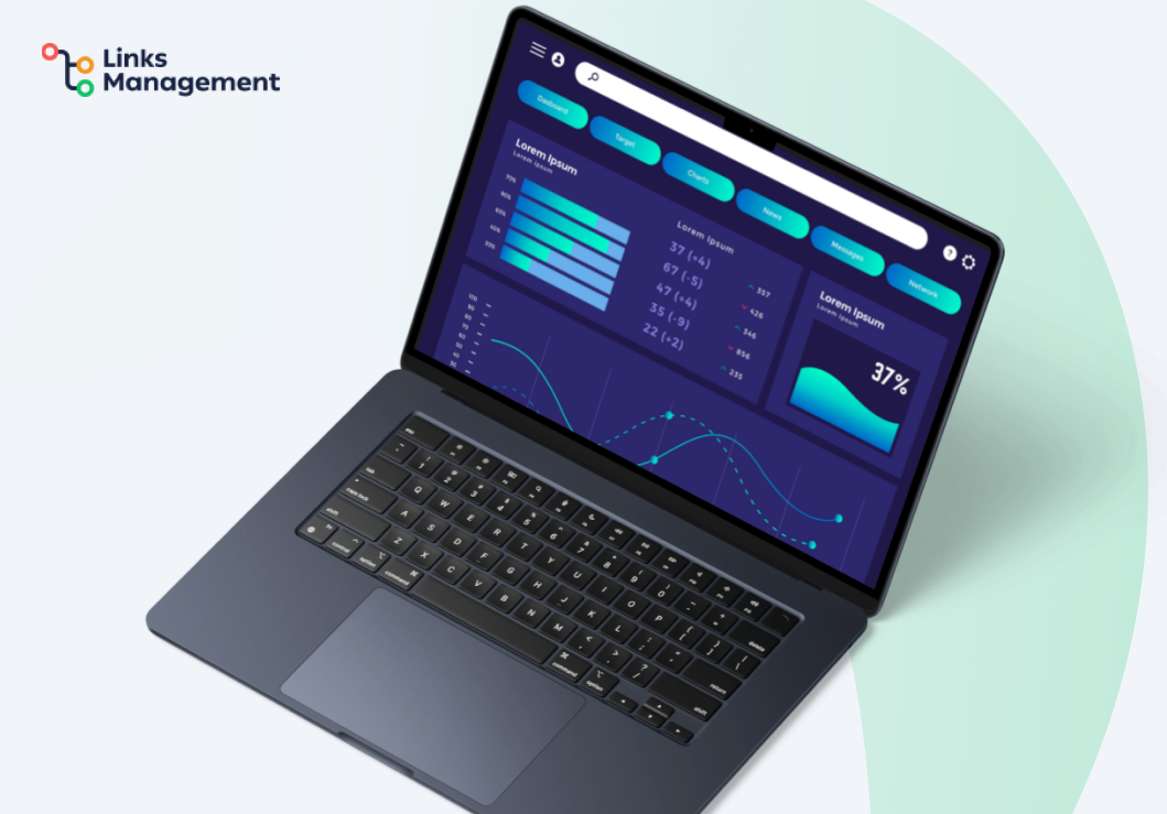
Still, using dashboards is not as straightforward as picking one tool and then calling it a day. Since there are so many types, you need to know which ones work well for each use case you might have.
In this guide, we will look at the different dashboard types in detail and share the best data dashboard examples to help you choose wisely.
Contents
What Are Data Visualization Dashboards, and Why Do You Need Them
A data visualization dashboard is a document or tool that helps you track any information in a visual format that reads like an infographic. So, instead of old, boring spreadsheets full of numbers, you get pictures, pie charts, graphs, and so on. Pretty neat, right?
But wait a minute. Can you turn any data set into a visual? Yes. Is it possible to visualize a giant yearly report in a dashboard? Yes.
Then, how about SEO performance metrics, or marketing reports, or…? Yes, and yes, and yes to anything that has to do with data that needs to be interpreted. Whether you need to visualize the financials or backlink metrics you got from paid guest posts, you can do that.
The best part? You can easily interact with the data and make it show you whatever you need at any given moment. Since data can pile up pretty fast and become overwhelming, this is a win.
🙋 Note: Of course, a lot of the functionality will depend on the tool you’re using. There are tons of options for any niche and task. To help you start in a good place, we’ll check some of the most universal options below.
But more than just making pretty documents, dashboards serve a very important purpose. This includes:
- Making it easy for marketers and SEO experts to break down complex data into easily digestible bits.
- Helping you spot trends and opportunities faster, which results in a quicker decision-making process.
- Allowing you to track your key performance indicators more efficiently and continuously.
Bottom line: Dashboard data visualization helps you deliver any information in a more digestible and effective way.
4 Common Types of Dashboards
Now that you can confidently answer the question, “What is a data dashboard?” it’s time to let you in on something. All dashboards are not created equal. Sure, this is a cliche thing to say, but it’s true.
But here’s the thing — once you understand how they are different, it becomes easier to choose the right type for your needs at the time. So, on that note, here are the common types you should know:
#1 Operational Dashboards
Operational dashboards are used to track daily activities and KPIs. They are updated in real-time frequently or, more accurately, minute-by-minute. Being able to see your current performance metrics allows you to take immediate action based on hard data.
This is a type of dashboard you use for your typical project management. It works whether you’re organizing an event, developing an app, or creating a content plan for the next month.
Simply put, using operational dashboards allows you to better manage your business. It also helps you optimize your administrative processes. There are many sample dashboards in this category, but a common one is an IT dashboard that monitors daily processes.
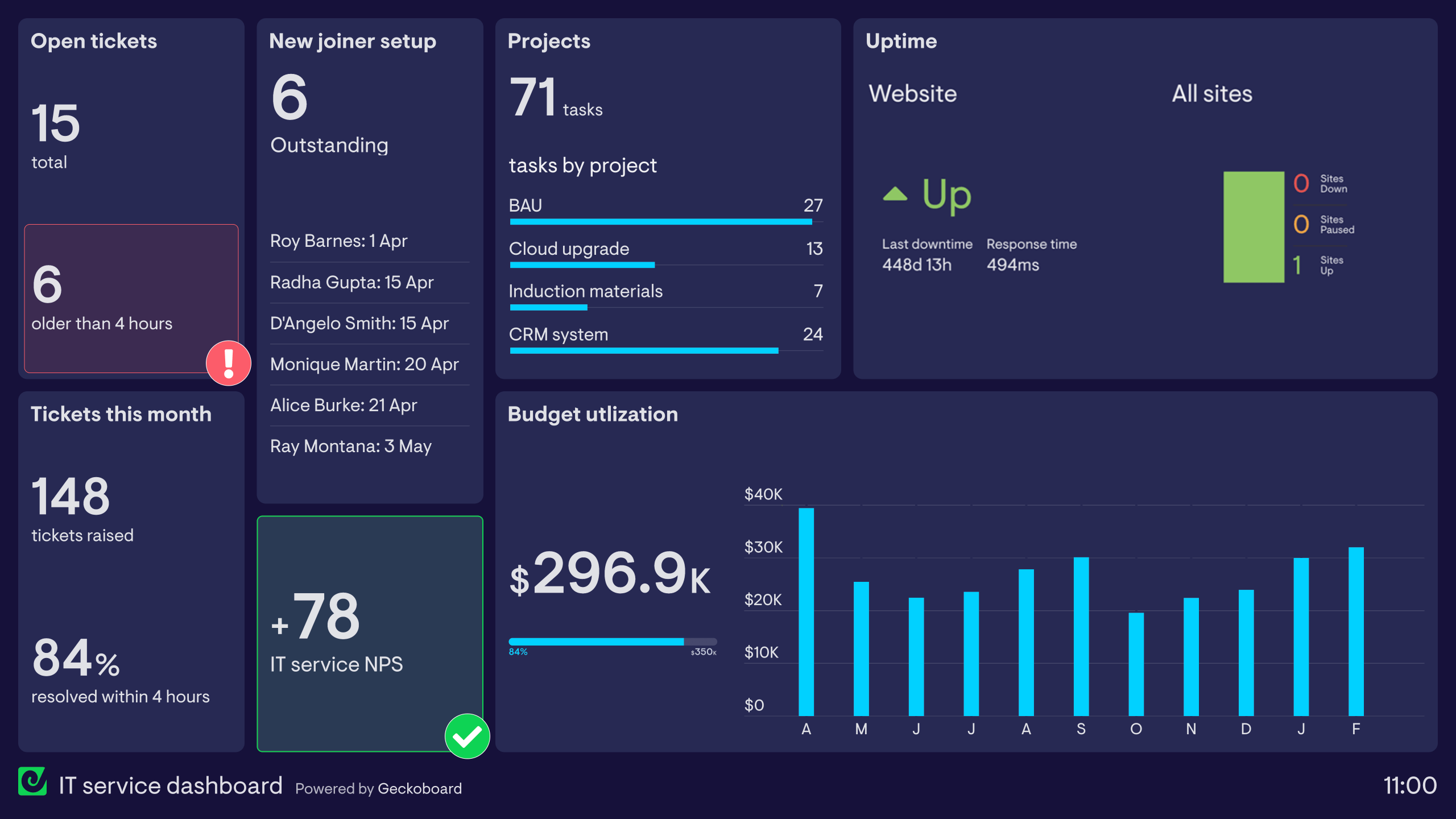
Source: geckoboard
#2 Strategic Dashboards
With operational dashboards, you get minute details (see what we did there?) about your performance. Yet, a strategic dashboard gives you a bird’s eye view.
This allows you to get a look into the long-term goals of your business. Plus, you can have a comprehensive view of the general trends.
They give you a more sitewide or enterprise-wide look into your business operations. As a result, these dashboards tend to be a little more complex than the other types. This explains why it’s commonly used at the leadership level.
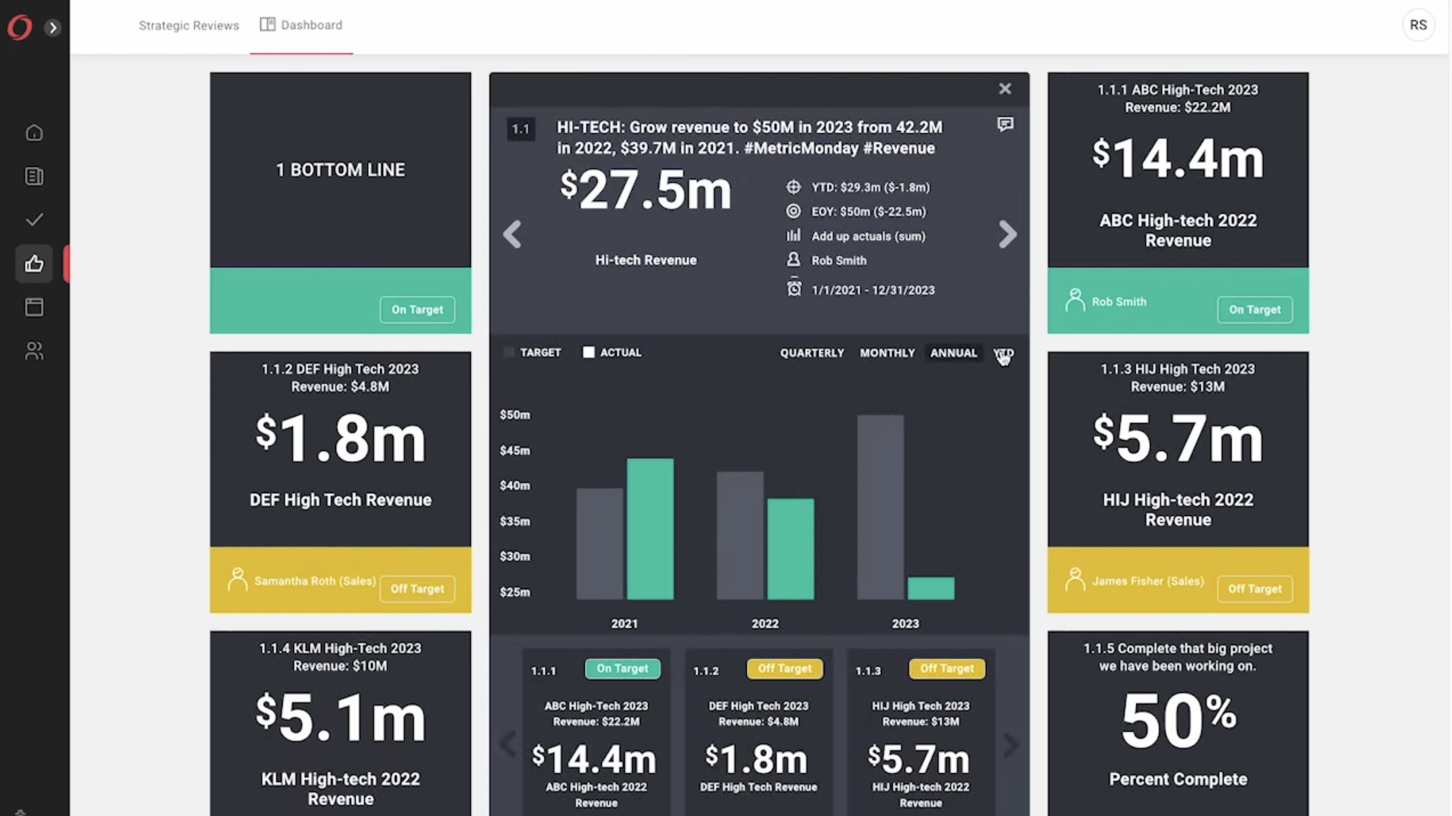
Source: On Strategy
#3 Analytical Dashboards
An analytics dashboard allows you to dive deeper into data for insights. It lets you do more complex analysis with data from multiple sources. You can usually see this type of big data dashboard used by data scientists, analysts, and research teams.
But hey, if it’s good for scientists, then it’s definitely good for managers and marketing experts. With one of these dashboard visualization systems, you can easily look at historical data. Based on that, you can identify trends and make comparisons.
What’s more, you can also make predictions about your projected growth when you have all those insights into your current performance. And more often than not, these predictions are accurate because they are based on large datasets.
An example is a business performance and strategy report like this one.
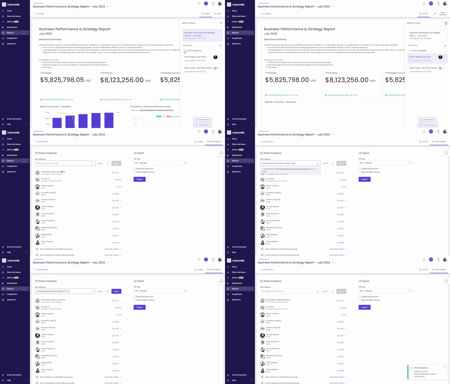
Source: Cascade
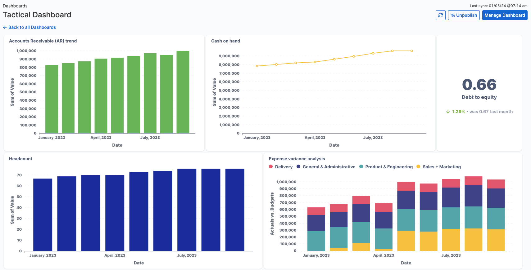
#4 Tactical Dashboards
Ever wondered if it was possible to marry two types of dashboards together? Well, meet the tactical dashboard — the perfect pair for the operational dashboard.
The tactical dashboard gives you a deeper insight into your ongoing daily operations. Yet, it still isn’t as deep and widespread as a strategic one.
You can use a tactical dashboard to monitor progress on specific projects. You’ll be able to get a zoomed-in view of the target process and quickly catch on to any problems that need to be fixed ASAP. As a result, you can then allocate your resources more effectively.
And the most useful part is that you can set very specific KPIs as it relates to each separate department. That’s why, while strategic dashboards often get overlooked, give them a try.
Source: Cube
Best Tools for Creating Dashboards (Free and Paid)
Now, you may be thinking that it is all great. But how can you make your own? What are your options in terms of tools for creating the very best dashboards for your needs? Well, we have a pleasant surprise for you — you have quite a few options.
Let’s see some of the beginner-friendly tools that can work for pretty much any business.
Tableau
Source: Tableau
🔝Best features: Advanced analytics and customization.
💰Price: From $15 per user per month and from $35 per user per month for the enterprises.
Some marketers say it is hard to beat Tableau when it comes to advanced analytics and customization options. The drag-and-drop interface makes it accessible for even newbies without a technical background.
The Data Guide helps break down any weird outliers in your data with an explanation. This allows you to better understand what is happening with those marks.
If you are a pro at data visualization, then you are probably going to love it even more. The best part? It supports massive datasets and can quickly turn them into beautiful, customizable visual assets. With the live data connection, you get almost instant data updates.
You can analyze multiple views simultaneously from one dashboard. This allows you to quickly get a bird’s eye view, which is great for spotting patterns quickly. This is especially helpful for noticing some easy-to-miss details when you are stuck in the minutiae.
Want to get alerts on visualizations when certain thresholds are reached? No problem. Well, as long as you are a cloud user.
Power BI
Source: Microsoft
🔝Best features: Straightforward interface and seamless integration with Microsoft ecosystem.
💰Price: Freemium and paid from $10.
Microsoft’s owned Power BI is no stranger in the data analytics world. It’s been described as super excel in some circles, but there’s more to it than meets the eye.
Like most dashboard tools for visualizing data, it combines different software and applications. Then, it pulls data together and makes sense of that visually.
Want something that integrates beautifully with the rest of the Microsoft ecosystem? Then this one should make you happy. It’s perfect for small to medium businesses who simply do not have the budget for expensive software.
It is available as a desktop and mobile app. So, you can easily pull data from many different sources. The best part? You can model the data to create stunning charts and graphs that help everyone else stay on the same page with you.
You can create workspaces for easy collaboration with your team members. This is great when you’re working on multiple projects with different teams assigned to each.
If the person isn’t in your organization, it isn’t an issue! Generating reports and sharing them with any external user is pretty easy as well, especially with Azure B2B.
One more thing: If you’ve heard people complain that it’s not user-friendly, don’t worry. The software has come a long way in recent years. Clearly, it’s one of the best simple dashboard examples out there today.
Yet, if you’re looking for something advanced, probably it isn’t the best choice.
Looker Studio (Formerly Google Data Studio)
Source: Semrush
🔝Best features: Google-native and user-friendly tool.
💰Price: Free.
Now, you may have known it in the past as Google Data Studio, but after Google acquired Looker in February 2021, they rebranded to Looker Studio.
That’s all great, but how does it help you?
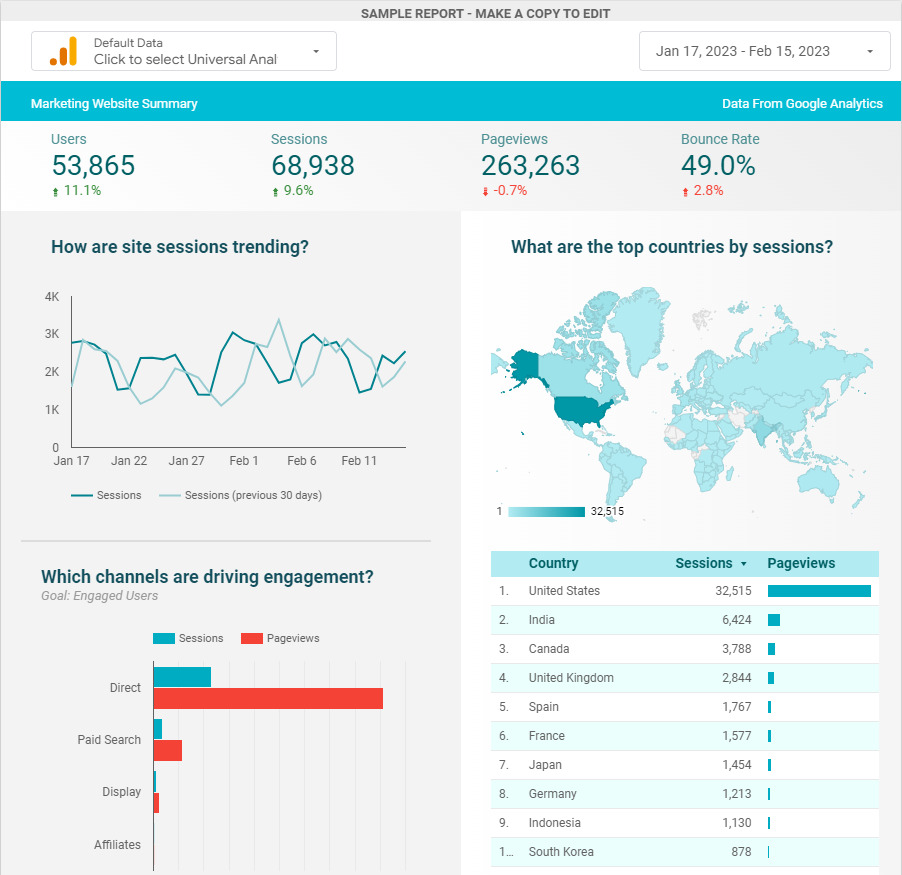
Looker Studio is one of the best data dashboards out there for marketers and SEO experts who need to do a lot of data reporting. Plus, it is actually free to use and makes it easy to sync your data.
Besides, the ability to create beautiful, cool dashboards relatively easily is another great feature that can simplify your operations and decision-making processes.
So, you can pull raw data from, say, your website or other sources and build graphs, tables, or line charts. These will show how your business or the clients are getting on.
Some of the information you can see includes features like where your site traffic is coming from. You can also see which content or products are getting the most engagement, your top-performing keywords, and more.
From there, it’s only a few clicks to generate easily digestible visual reports for your business or your clients.
Good Dashboard Examples & What We Can Learn From Them
Thankfully, there are many dashboard project ideas and even reporting dashboard examples that you can use as a guide when needed. This saves you from the frustration of doing hours of work only to find out you missed some important details.
Even better, you can simply customize one of these and use that as a template for any of your own projects. Here are a few effective dashboard examples and what we can learn from them:
SEO Reporting Dashboard (Ahrefs)
Source: Ahrefs
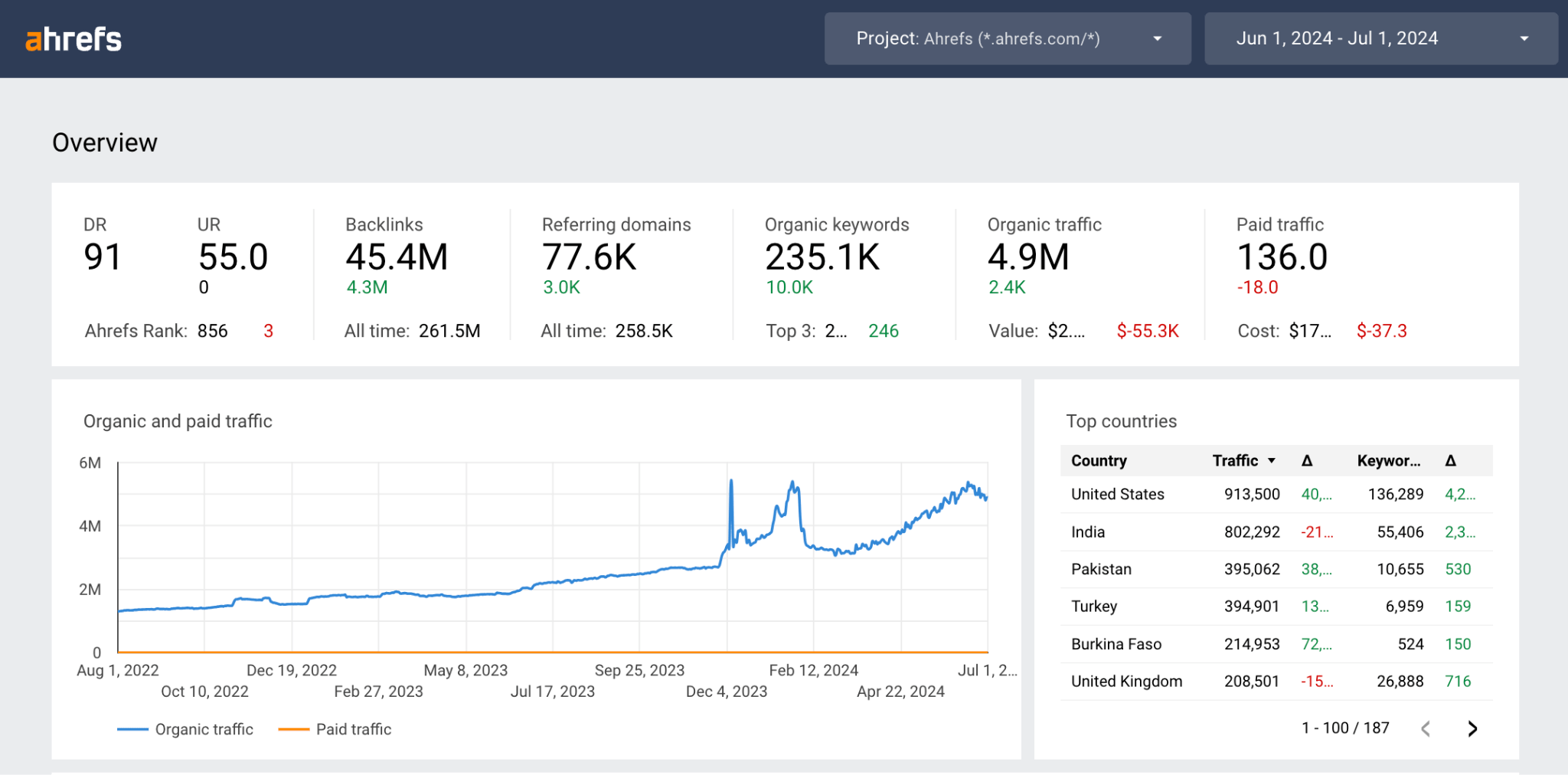
If you are using any comprehensive SEO tool, congrats — it is one of the great dashboard examples that helps you visualize your website performance.
Of course, it is primarily software for measuring all your SEO metrics, but it is still great at visualizing. Now, the data you see can be different based on the tool itself, customization, and personal preferences.
Most platforms show you your domain authority, backlinks, keywords, and organic traffic metrics. Basically, KPI visualization examples like this have everything to help you track how effective your SEO strategy is.
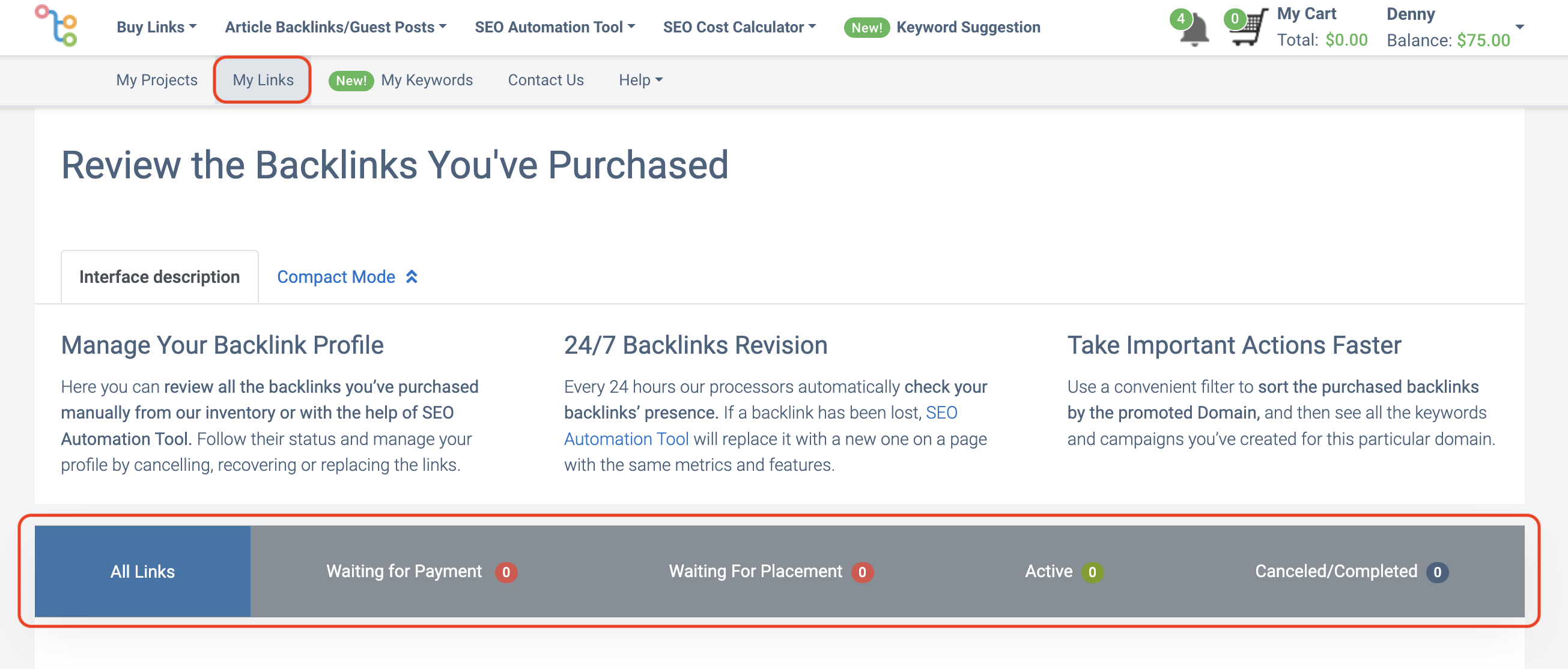
💡 Pro tip: Combine several SEO tools to get the best reports. Don’t limit yourself to one software. If you’re using several platforms, see what they have to offer. For example, if you buy backlinks with LinksManagement to improve organic traffic, you can track additional link-building metrics.
It is especially useful when you have multiple clients because you can easily monitor multiple projects. Plus, you can check both your permanent and monthly backlinks.

And, of course, you can track the whole process of getting your links, from payment to completion.
Project Progress Dashboard (ClickUp)
Source: ClickUp
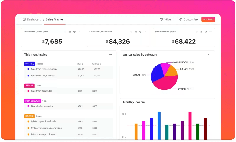
The easiest way to find interactive dashboard examples for your project progress is by checking out different PM tools. While their main goal is to help you assign tasks and get things done, most of these platforms also offer you great visualization options.
It is worth saying that most of the cool dashboards are only available with the paid plans. Still, even if you’re a small team and can’t afford it yet, you can at least get some inspiration. Then, you can take your ideas and bring them to life with a different, free tool.
Social Media Dashboard (SproutSocial)
Source: SproutSocial
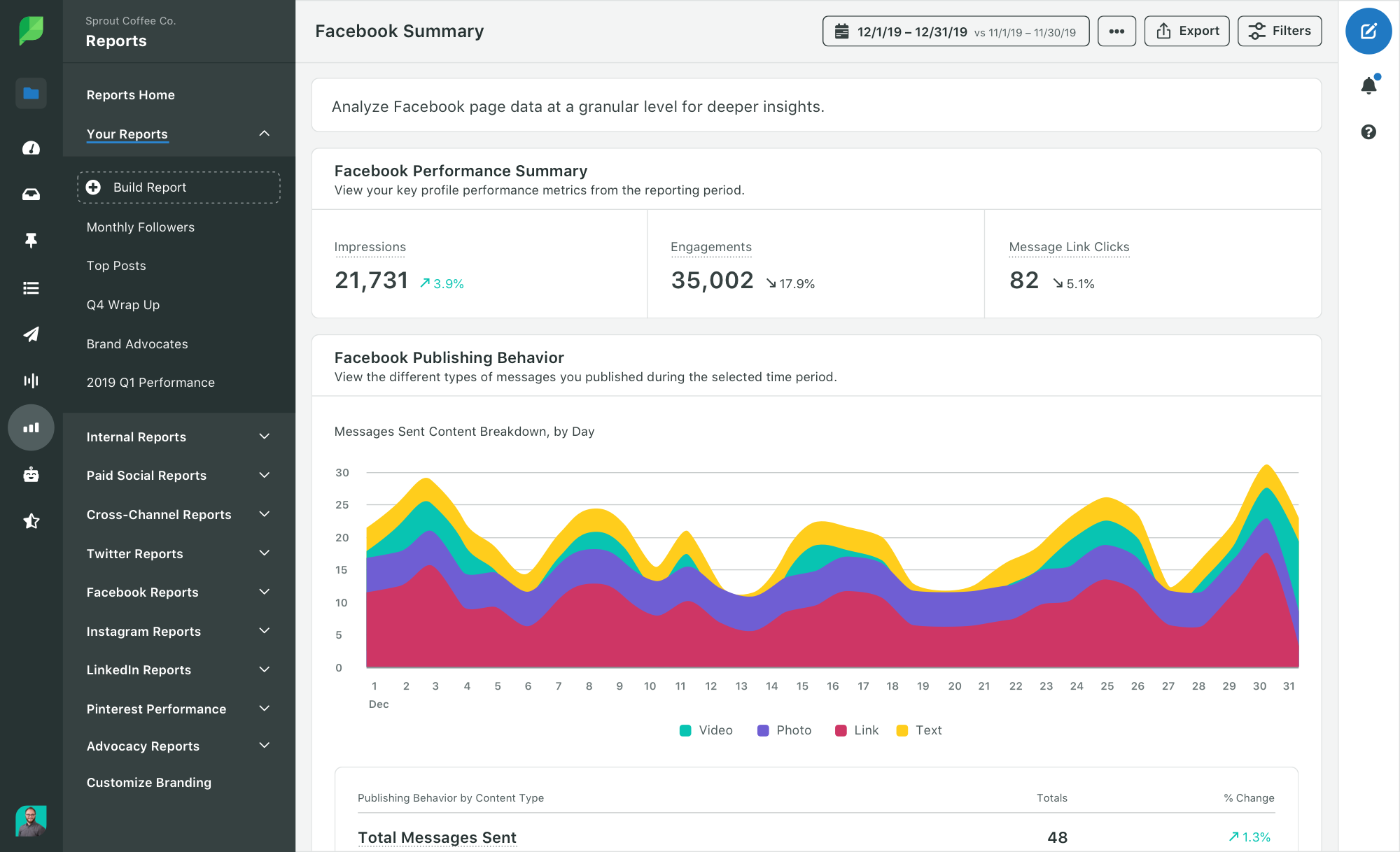
You can’t talk about dashboard ideas or examples without mentioning social media tracking. If you are active on different platforms and you want to convert all that activity, having a dashboard like this is a must.
These dashboards can be very different, depending on your needs. Some of them can show your profile performance, and others can help you picture what your brand’s social mentions look like.
So, if you feel like the built-in features of the socials you’re using aren’t enough, you can consider an extra tool for better visualization and deeper insights.
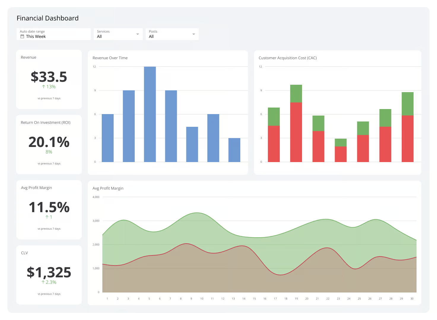
Financial Dashboard (Klipfolio)
Source: Klipfolio
The financial dashboard is one of the more common business dashboard examples. It is no rocket science that every company has to know their earnings, profits, and expenses. And we’re sure yours does.
Still, wasn’t your financial department sometimes bringing you confusing reports that hardly made any sense to you? Exactly! That’s why a financial dashboard is your life-saver here.
Sure, you could rely on the traditional way of bookkeeping, but a visual dashboard is a great addition to effective reporting.
Product Usage Analytics Dashboard (UserPilot)

Source: UserPilot
The good thing about using a data dashboard is that there is one for everything. You can even come up with new ones to match your unique products.
Those in the SaaS industry rely on many different types of interesting dashboards. These include the in-app product usage dashboard that gives you insight into how people actually use your product.
A visualization like this helps you check which features are crowd-pleasers and which ones need a revamp.
Conclusion
Data is not a whim in the business world — it is a necessity. You want to make sure you are not shooting blanks when coming up with your campaign strategy. For this, you need a visual data dashboard to help you turn that raw data into strategic decisions.
Which one is best? Well, we have looked at many online dashboard examples. Since your business is special, make sure you check different options to choose the ones that actually make sense and help your company grow.
Enter URL & See What We Can Do Submit the form to get a detailed report, based on the comprehensive seo analysis.


